 |
| This one is the most intricate and busy, I think its straight forward enough though. This might just be my favorite cover. |
 |
| I like this idea, but there is a lot of white space considering its a cover... |
 |
| Another variation of the Swatches cover. This is my second favorite. |
 |
| I love this compromised TOC! I combined the strongest aspects of my other TOC and added the swatch bars to create unity between the cover, title page, and table of contents. |
 |
| I like the idea but it didn't come out quite like I planned. The "Swatches" is lost in the color. |
 |
| I like the concept of this one, but it depends what cover I select |
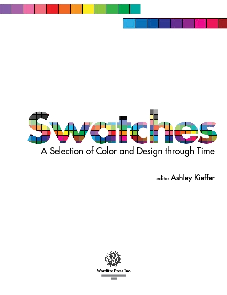 |
| I love the "Swatches" title filled with actual swatches, but the color bars along the top are a bit distracting I think. |
 |
| Previous design simplified: I prefer the TP without the swatch bans across the top for this particular design. |
No comments:
Post a Comment