Here are a few different applications of the font. I like this font particularly because it reads easily and has a vintage air to it. The serif fonts always seem more formal (and more dated) to me, which is not necessarily a bad thing. The third poster shows that it can be applied in more whimsical manners as well as the traditional organized, gridlocked text. The second to last image is a book cover that features several texts, including Goudy Old Style. I thought the balance of various texts created a nice contrast to the layout.


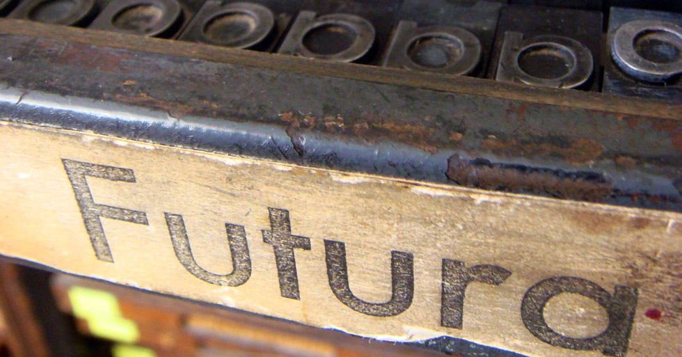
Futura
Again, we have the photo examples of this font, Futura. This font, in contrast to Goudy Old Style, is a sans serif font and lacks the "old fashion" kind of look. When I see this font I think of Bradbury Thompson and cutting edge designers (of their time). I think futura is much more versatile when it comes to more expressive or abstract text compositions. You can link the letters together more smoothly (because there are no serifs and the weight is consistent throughout all the strokes in the letters).


Other interesting Typeface based covers
Here are a few more examples of typefaces that I found particularly successful when used in a book cover composition.


No comments:
Post a Comment