Search This Blog

Monday, April 30, 2012

New Design for New Title

More like, we finally decided our title so now I can actually design some spreads that goes with the idea. Our title is Swatches: A Selection of Color and Design through Time

This one is the most intricate and busy, I think its straight forward enough though. This might just be my favorite cover.

I like this idea, but there is a lot of white space considering its a cover...

Another variation of the Swatches cover. This is my second favorite.

I love this compromised TOC! I combined the strongest aspects of my other TOC and added the swatch bars to create unity between the cover, title page, and table of contents.

I like the idea but it didn't come out quite like I planned. The "Swatches" is lost in the color.

I like the concept of this one, but it depends what cover I select
I love the "Swatches" title filled with actual swatches, but the color bars along the top are a bit distracting I think.
Previous design simplified: I prefer the TP without the swatch bans across the top for this particular design.


Color Education

This is an interesting article about color and color interactions, in particular context to interior designers but it applies to all matters of designs that seek to include color. Here is the link: Sherwin Williams - Color Education


An excerpt from the text:
"The human eye can discriminate millions of colors. Today's consumers of color are increasingly looking for options that have a fresher, cleaner appearance. They are also seeking a broader range of the spectrum to enjoy color in more interesting ways.
The designer's challenge is bringing order to the myriad colors available through an understanding of the psychological and physical ways to manipulate colors intelligently. Working with a color organization system makes this task much easier."

"Colors of similar visual temperatures lay adjacent to each other on the color wheel. Because of this arrangement, it is easy to contrast the differences: the warm colors – the reds, oranges and yellows – appear opposite the cool colors – greens, blues and purples.
Color wheels also make it easier to apply classic color theories to a design project. Monochromatic, analogous, triadic and complementary color schemes are used most often. Monochromatic schemes utilize one hue. Analogous schemes use two hues that are adjacent to each other on the color wheel. Triads use three hues that are equidistant from each other on the wheel. Tetrads are four hues evenly spaced on the color wheel."

Sunday, April 29, 2012

A Source of Inspiration

That is.... The Book, Jacket, and Journal Show:


Almost even more inspiring, but in a different sense, was our side "adventure" to the Design research building next door. This self-sustainable building was incredible! I seriously want some of these feature in my future house or something. I can't imagine how cool it would be to have a building like this as my personal studio. It was gorgeous and environmental. Here are a few shots I took of the building:

The conference room with a vegetation wall feature to stimulate relaxation and health

100% recycled material counter tops along the back wall of the conference room

Front desk as you walk into the building

Exterior View

Saturday, April 28, 2012

Table of Contents and Title Pages!


Revised and Final Designs

After having a group critique and getting feedback from Margie, though the R spread was cool, the overall consensus was that I should go with the second version of CMYK line spread. I revised it a bit and shifted a few things around to come up with this:


--
And with a smidge more adjustments to reduce the concentration of positive space on my page (and create more negative, resting space), I came to this design. Here is my final spread design and layout to be printed:


Spread Designs

We had to design 3 different 4 page (2 sets) spreads for our individual designers. Here are the three that I cam up with! (all are inspired by his CMYK usage in his work and different elements of his work)


Thursday, April 19, 2012

Group Book Info

Table of Contents Order (Chronologically):
Bradbury Thompson - 1911 (Ashley Kieffer)
Paul Rand - 1914 (Amy Kong)
Armin Hofmann - 1920 (Kristi Thompson)
Saul Bass - 1920 (Shelby Lemon)
Milton Glaser - 1929 (Torie Bunton)
John Lasseter - 1957 (Ryan Benedick)
Marc Newson - 1963 (Lindsey DeLallo)

--

Consistent Features across Pages:
- 9pt font (11pt spacing)
- 1 full page graphic (anywhere)
- isolated quote (on full graphic page somewhere)
- header (ex. "Graphic Design: Bradbury Thompson", formatted Black Text: Color Text, 7pt font)
- Photo of designer (on first text page somewhere)
- Title will be the name of designer (large, upper left of 1st text page)
-  bright colors (1 or more pages solid color background and colors used as design/text accents)
- name at the end of your essay (left aligned on its own line)

Monday, April 16, 2012

400+ Words about my Designer

Bradbury Thompson was born not too far from our own university here in Lawrence – he was born in Topeka, Kansas in 1911. He was educated at Washburn University, where he studied printing production. There he developed his skills as a student editor and designer. Thompson learned the printing business, from typesetting to binding, and graduated in the year 1934. He kept in contact with the university throughout his graphic design career and later worked with Washburn University to create the Washburn College Bible. This book is considered to be the “most significant development in Bible typography since Gutenberg first published his masterpiece in 1455” (RIT Libraries). Thompson also developed more than ninety stamp designs, making him the most prolific of American stamp designers. His unique employment of the letter press process produced an unprecedented typographic style and book spread layouts. One of his successful typographic projects was his publication of Alphabet 26, labeled as a monoalphabet, which “contained only 26 unique characters, case was established by size only instead of entirely new characters (i.e. r/R, e/E, a/A)” (Design Is History).  His name dominated the graphic designer commotion throughout his career.
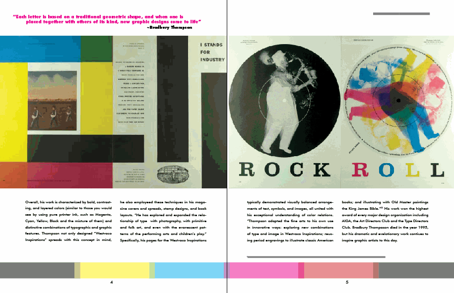
One of his most well-known contributions to the design world is his letter press work for the Westvaco Corporation. “Westvaco Inspirations was a promotional journal produced by the Westvaco Corporation, formerly known as the West Virginia Pulp and Paper Company. The purpose of the journal was to highlight the printing processes and quality of paper achieved by the Westvaco paper Mills” (RIT Libraries). Thompson produced more than 60 issues of the Westvaco Inspirations, all of which displayed his excellent intuition for strong design. Overall, his work is characterized by bold, contrasting, and layered colors (similar to those you would see by using pure printer ink, such as Magenta, Cyan, Yellow, Black and the mixture of them) and distinctive combinations of typographic and graphic features. “He has explored and expanded the relationship of type  with photography, with primitive and folk art, and even with the evanescent patterns of the performing arts and children’s play” (J. Carter Brown, Art of Graphic Design). Specifically, his pages for the Westvaco Inspirations typically demonstrated visually balanced arrangements of text, symbols, and graphics, all united with his exceptional understanding of color relations. “Brad Thompson adapted the fine arts to his own use in innovative ways: exploring new combinations of type and image in Westvaco Inspirations; reusing period engravings to illustrate classic American books; and illustrating with Old Master paintings the King James Bible” (J. Carter Brown, Art of Graphic Design).


Two quotes from the designer I found particularly interesting:
 
“There is no creative aspect of graphic design more rewarding than the indulgence in play.” 
~Bradbury Thompson

“Each letter is based on a traditional geometric shape, and when one is placed together with others of its kind, new graphic designs come to life”
~Bradbury Thompson
 

Works Cited
"1977 Hall of Fame: Bradbury Thompson." Art Directors Club: 1977 Hall of Fame. Art
Directors Club, 2012. Web. 15 Apr. 2012.
<http://www.adcglobal.org/archive/hof/1977/?id=277>.
"Bradbury Thompson." Design Is History. Web. 12 Apr. 2012.
<http://www.designishistory.com/1960/bradbury-thompson/>.
"Bradbury Thompson." RIT Libraries. Rochester Institute of Technology. Web. 12 Apr. 2012.
 <http://library.rit.edu/gda/designer/bradbury-thompson>.
Brown, J. C. "An Appreciation." Foreword. Bradbury Thompson: The Art of Graphic Design. By
Bradbury Thompson. New Haven: Yale UP, 1988. Viii-Ix. Print.
"Westvaco Inspirations - Design by Bradbury Thompson." Grain Edit. Grainedit, 2007. Web. 15
Apr. 2012. <http://grainedit.com/2008/02/04/westvaco-inspirations-design-by-bradbury-
thompson/>.

Thursday, April 12, 2012

Bradbury Thompson


The graphic designer I selected was Bradbury Thompson, 1911-1995. 


A well-rounded designer . . .
- Studied printing production
- Became an art director for Mademoiselle magazine
- designed books
- Explored and pushed the boundaries of conventional typography
- taught design at Yale University

Inspirational, a collection of art . . .
- 1969-1979 created the Washburn Bible (in a collaboration with Washburn University)
- Alphabet 26
- 1939-1962 designed Westvaco Inspirations, a promotional magazine published by the
Westvaco Paper Corporation

Recognized and Awarded . . .
- His work won the highest award of every major design organization including AIGA, the Art Directors Club and the Type Directors Club.


 Here are a few images (taken from Google.com) of his work that I find particularly engaging:


Tuesday, April 10, 2012

Final Beautiful Box!

Made with love! I really love how the finish turned out on it. It really brought out the red and bleached yellow hues in the Red Cedar wood.