Journal Entry: TM Research Archive
Check out the TM Research Archive. Find 6 - 10 images that resonate with you. Find out about the designer, reflect why you selected the images
 |
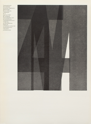
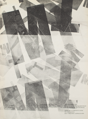
| Cover Design: André Gürtler & Bruno Pfäffli | Typeface: Univers |
I chose this page because I love the use of negative space to create movement. The shapes that are made remind me of like a flock of bird. I get a sense of migration from the image the forms create. "With André Gürtler and Bruno Pfäffli, Adrian Frutiger established a graphic design studio in the Paris suburb of Arcueil in 1962."
 |
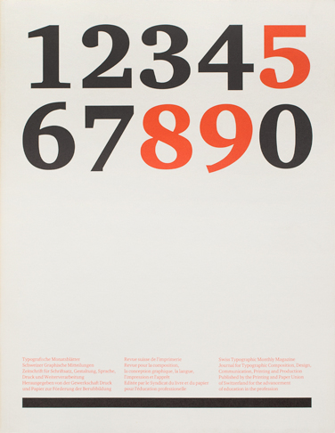
| Cover Design: Siegfried Odermatt | | Typeface: Monotype Grotesque | | Description: Photograph by W. S. Eberle |
I chose this cover because I liked the contrast of the black and white photo. The image brings the viewer in and then your attention is brought to the small text because the text is red. The image and the text work well together because of color and scale.
|
|
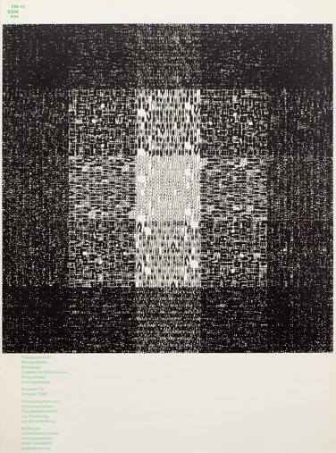
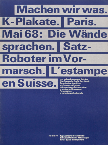
| Cover Design:Hans-Rudolf Lutz | Typeface: Univers | | Printed pattern produced with by overprinting |
I am not sure what happened to the formatting of this image/caption..... But I liked this page because I think the idea of the layout being a little more abstract is an interesting way to engage the viewer. I also like the idea of small typography making a bigger picture from further back.
 |
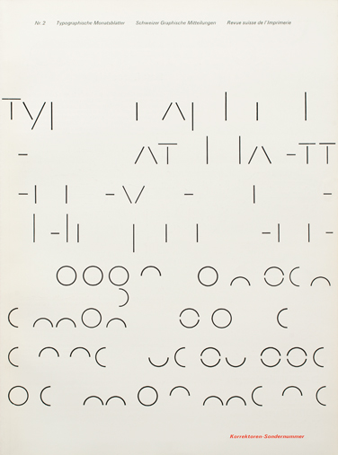
| Cover Design: André Gürtler | Typefaces: Lettering & Univers |
I chose this one for a similar reason as the previous one. I like how typography is used a little less traditionally and how the letters take on new forms to create an abstract pattern. The rhythm here is more important than the legibility.
 |
| Cover Design: Horst Hohl | Typefaces: Ruder Grotesk, Univers | Description: Use of ‘Ruder Grotesk’, a wood type designed during an evening class by Emil Ruder and students in the early fifties. It was never commercially produced and was used exclusively at the Basel school workshop. |
I chose this page because I like the contrast of typefaces as well as scale. The lighter overlapping opacity of the big letters creates interesting shapes in the letters and also makes them look more "handmade" or personal. The big letters get your attention and the smaller text holds it there. (your attention stays on the page, that is)
 |
| Cover Design: Hans Ferdinand Egl | Typeface Univers |Description: Illustration made with type components from Ruder Grotesk, kerosene and a rotative press. |
I chose this page because I like the jumbled, more loose composition. I think the text becomes much more expressive when you break it out of the clean, evenly spaced blocks. I also like the range of opacity here.
 |
| Cover Design: Felix Berman | Typeface: Univers |
I chose this cover because I liked the simple movement caused by the repeated style of formatted type (in weight and size) It is also an interesting composition on the page (with the margins being inconsistent)
 |
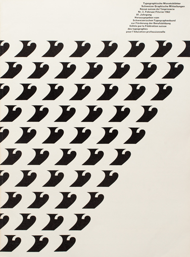
| Cover Design: Max Caflisch | Typeface: Charter |
I chose this page because I liked the open space and clean layout. The scale and color change helps break up the page and also lead our eye around the composition. The heavy dark line at the bottom was a nice way to balance out the heavy dark letters at the top.
 |
| Cover Design: Felix Berman | Typeface: Univers |
I chose this one because I liked the simple color palette and the blocked out layout. I like the rhythm that the word blocks create. The size shift in type is also a nice way to show hierarchy. The negative space on this page also helps the page from looking overcrowded.


No comments:
Post a Comment